How to choose the best font for your resume

choose the right one for yours? Good resume fonts are clean and simple and, most importantly, keep the focus on your qualifications. We’ll show you how to choose the best font for resumes and impress employers with your style.
The font on your resume might seem like a minor detail, but don’t overlook it. The right resume font can present you as a polished, professional candidate who’s worthy of a closer look. But what’s the best font for a resume?
We’ll show you the top options with tips for choosing the best font for your resume that makes you stand out for all the right reasons.
What’s the best font for a resume?
There’s no single best resume font, but here are some good options that are worth checking out:
Elevator Pitch Newsletter
Once every 2 weeks, our experts gather the best career & resume tips you can read in 15 minutes or less. Straight to your inbox!
Subscribe
By signing up you agree with our Terms of Service and Privacy Policy.
- Arial
- Calibri
- Cambria
- Garamond
- Georgia
- Helvetica
- IBM Plex Sans
- Lato
- Open Sans
- Roboto
- Source Sans Pro
- Times New Roman
- Trebuchet MS
- Ubuntu
- Verdana
The best resume fonts are clean, easy to read, and professional. They keep a hiring manager’s focus on the content of your resume—not on an unusual or distracting font choice.
A good resume font should also be readable for applicant tracking system (ATS) software, which many employers use to scan and rank resumes. This will help ensure that your resume makes it past the software and into the hands of a real person.
Font choice is equally important for cover letters. If you’re also working on your cover letter, check out our article on the best cover letter fonts.
Should you use a serif or sans serif resume font?
A common question is whether to use a serif or sans serif font for a resume. Here’s a quick comparison of these two styles:
- Serif: These fonts have decorative strokes, known as serifs, added to their letters. Serif fonts, such as Times New Roman, usually have a classic, traditional feel.
- Sans serif: In comparison, these fonts have clean lines with no serifs or artistic flourishes. Some experts say sans serif fonts, like Arial, are more readable on computer screens.
While sans serif fonts may look slightly cleaner, you can use either type of font for your resume as long as it’s simple and easy to read. If you’re unsure, print out a copy of your resume to check the font readability.
Top 15 best fonts for a resume
Not sure which font you want to use for your resume? Here’s a comparison of the best fonts for resumes, including their pros and cons:
1. Arial
Arial is a modern sans serif font with clean lines and good legibility. It’s a safe choice if you want something straightforward and easy to scan. However, it is a fairly common font, so it may not help you stand out from the crowd.

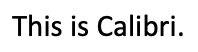
2. Calibri
Long the default typeface for Microsoft Word, Calibri is a highly readable sans serif font with a modern, crisp look. Like Arial, though, it’s also a common font that may not give your resume a very distinctive look.
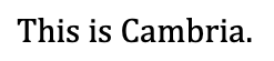
3. Cambria
Cambria is a serif font that balances traditional and modern. It also looks great in smaller sizes. It’s slightly more formal than some other fonts on this list, so it may look out of place on resumes for creative industries.
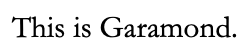
4. Garamond
This classic serif font has roots dating back hundreds of years. Garamond looks distinctive and interesting without being over the top, making it a popular font for print. However, it can be slightly harder to read on a screen.
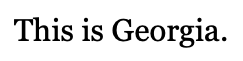
5. Georgia
Known as an alternative to Times New Roman, Georgia is an attractive serif font. Like Cambria, it reads well in smaller sizes. That said, many people tend to use this font, so it may feel more generic than others.
6. Helvetica
Helvetica is a classic, widely used sans serif typeface. This font is so popular that it’s even the focus of a documentary with the same name. Then again, it may be too popular, especially if you’re looking to distinguish yourself.
7. IBM Plex Sans
This font has a sleek, professional feel. But even with its clean lines, it has enough personality to set your resume apart. It’s a newer font, so it may feel less established than other ones on this list.